At the begging of this year I had the opportunity to present a proposal for a furniture company called Cadeera. For them Sustainability is a key word, it means everything that exists already, that can be reuse, redesign and restored. Therefore I wanted to portray this into their website.
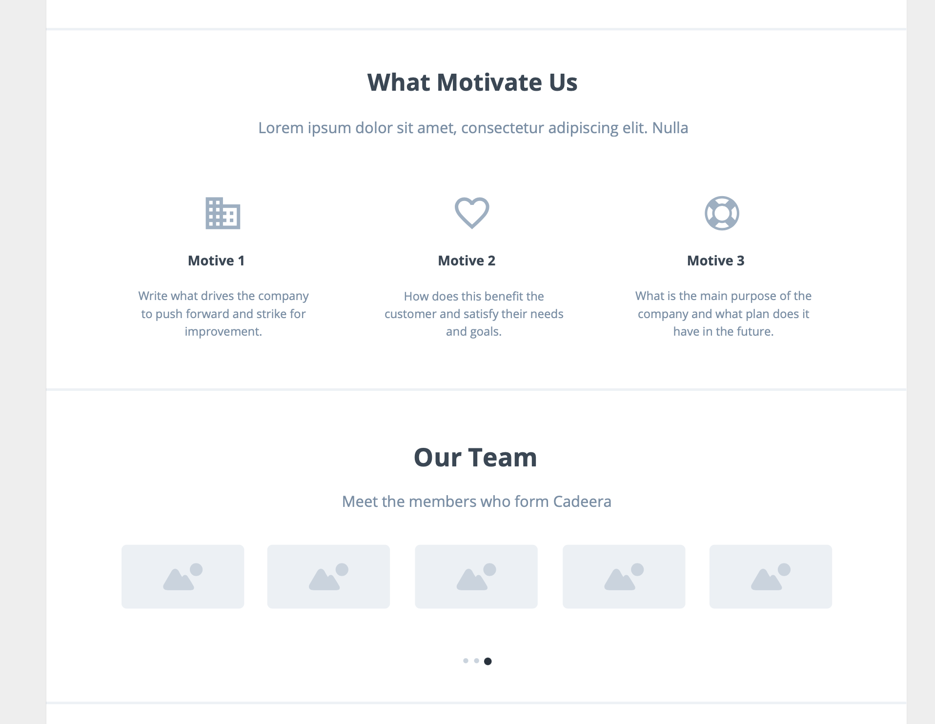
To help Cadeera achieve this, I have provided a new approach by redesigning their website to create a better user experience as well as creating new content within the website for users to understand better Cadeera’s history and what they want to transmit. Additionally, some users strike for quality and trust in sellers when deciding which piece of furniture to buy. This is what Cadeera wants to build, a platform where the users can find all this information by making their research more accessible. Their mission is to elevate users’ space with responsibility sourced design.
WORK PROCESS & DEVELOPMENT
MOCKUP DESIGN.
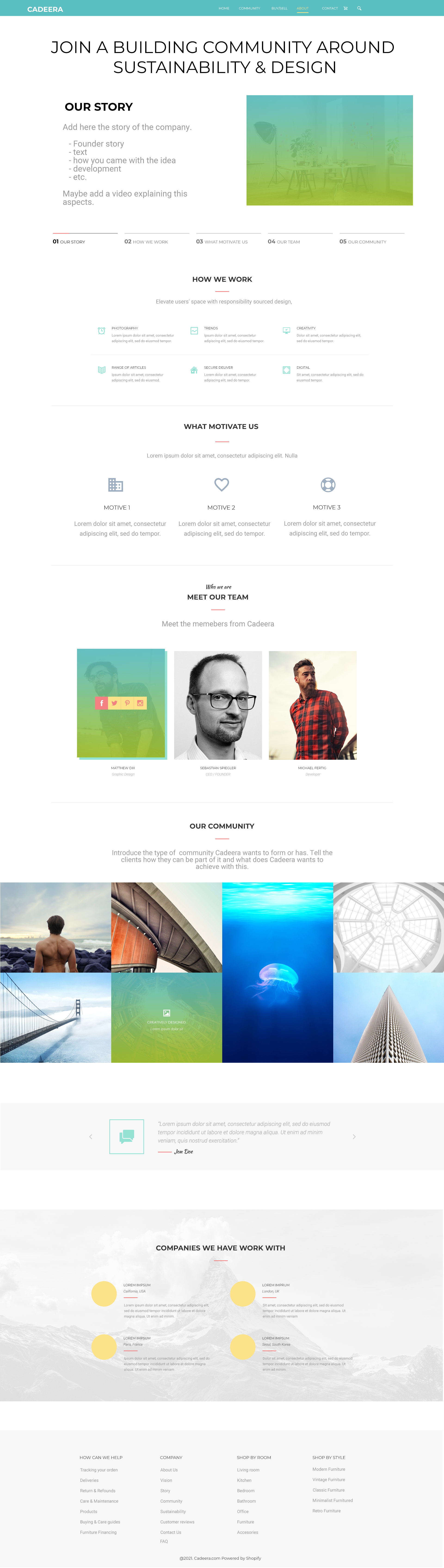
Create a set of wireframes to showcase how my designs would look on a website size. Soon I realized that this was only a first prototype of the website’s appearance, and when later translating it into mockups some parts would need to be modified as they would no longer be as effective as they were on the wireframes.
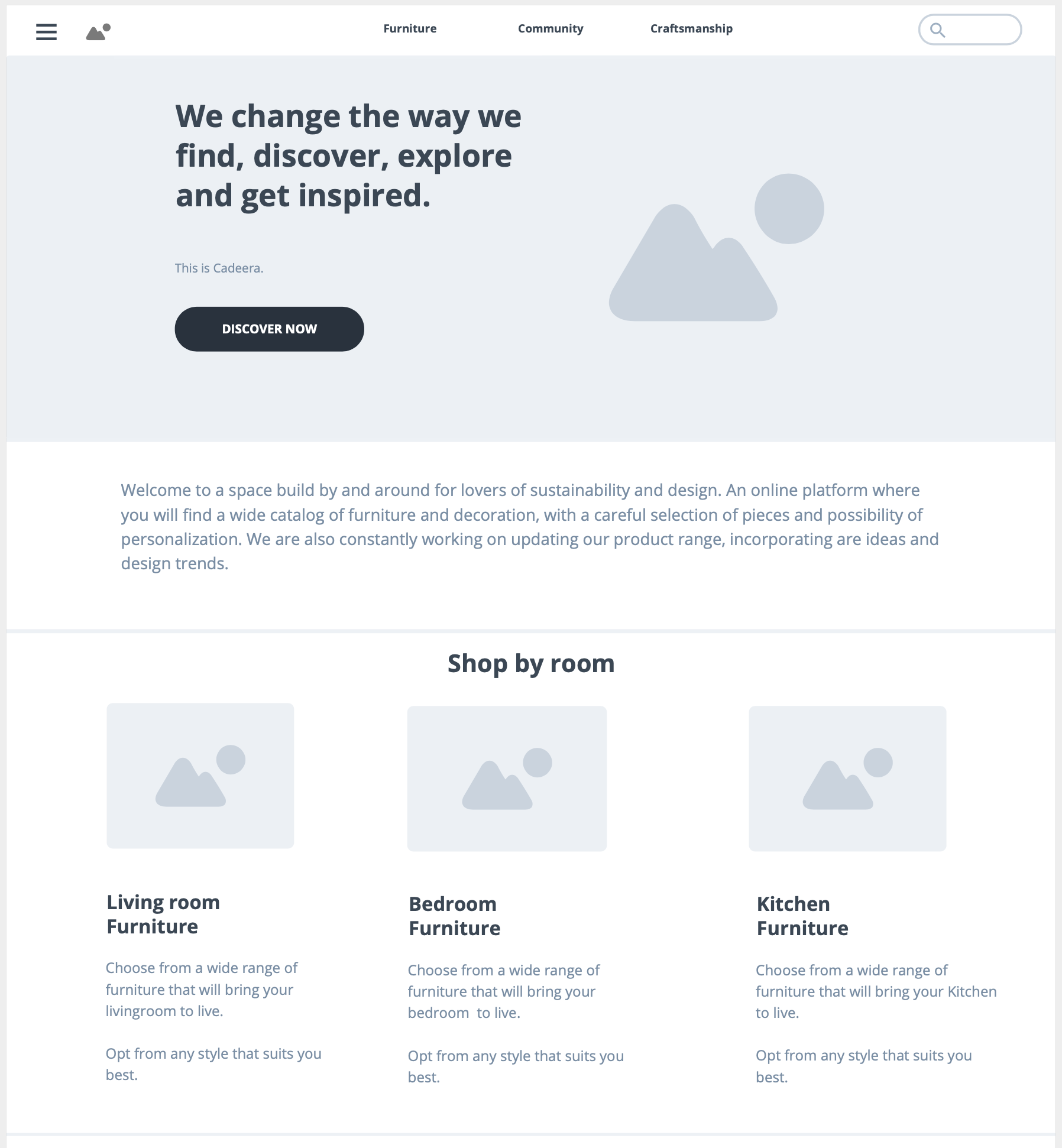
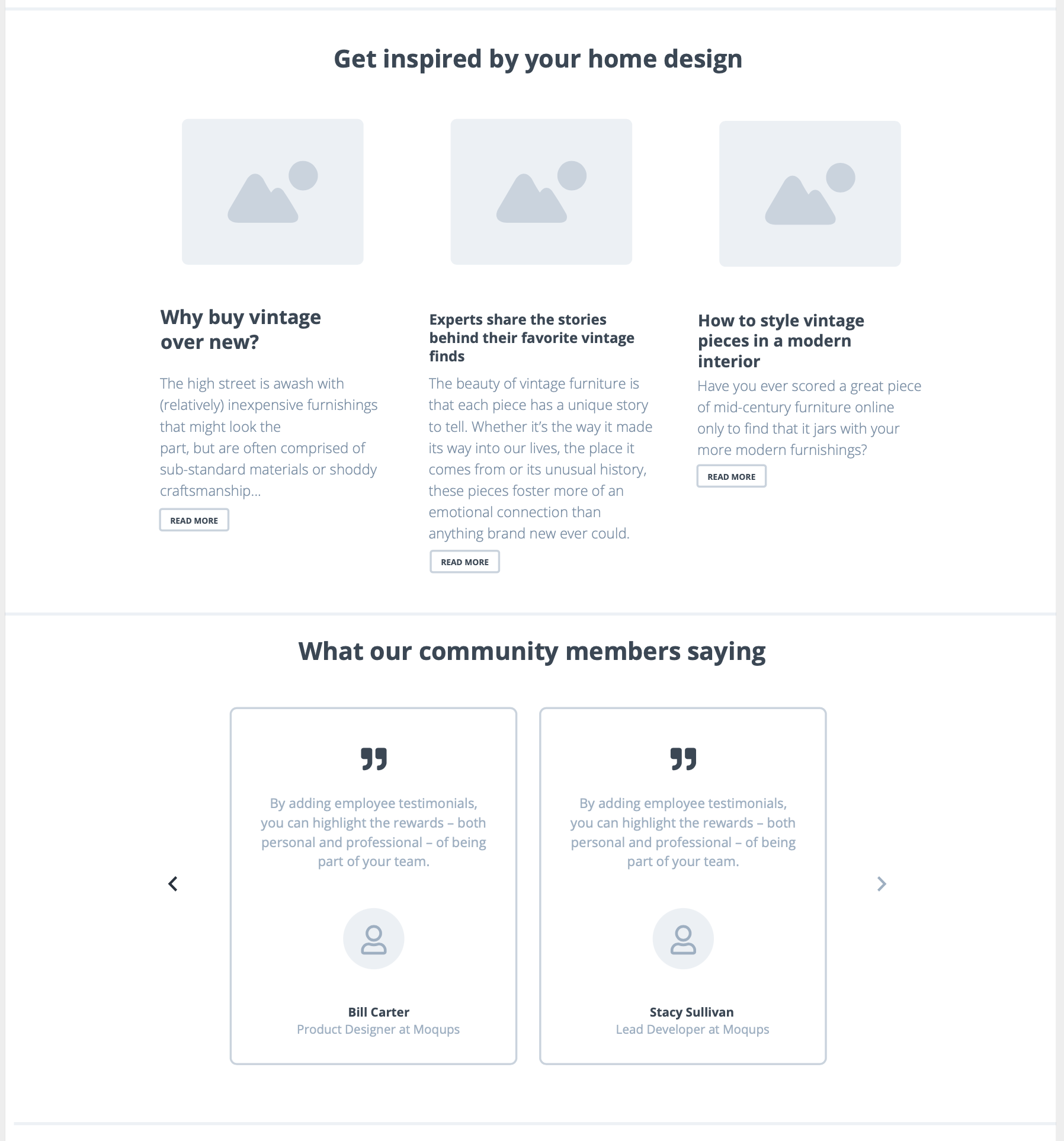
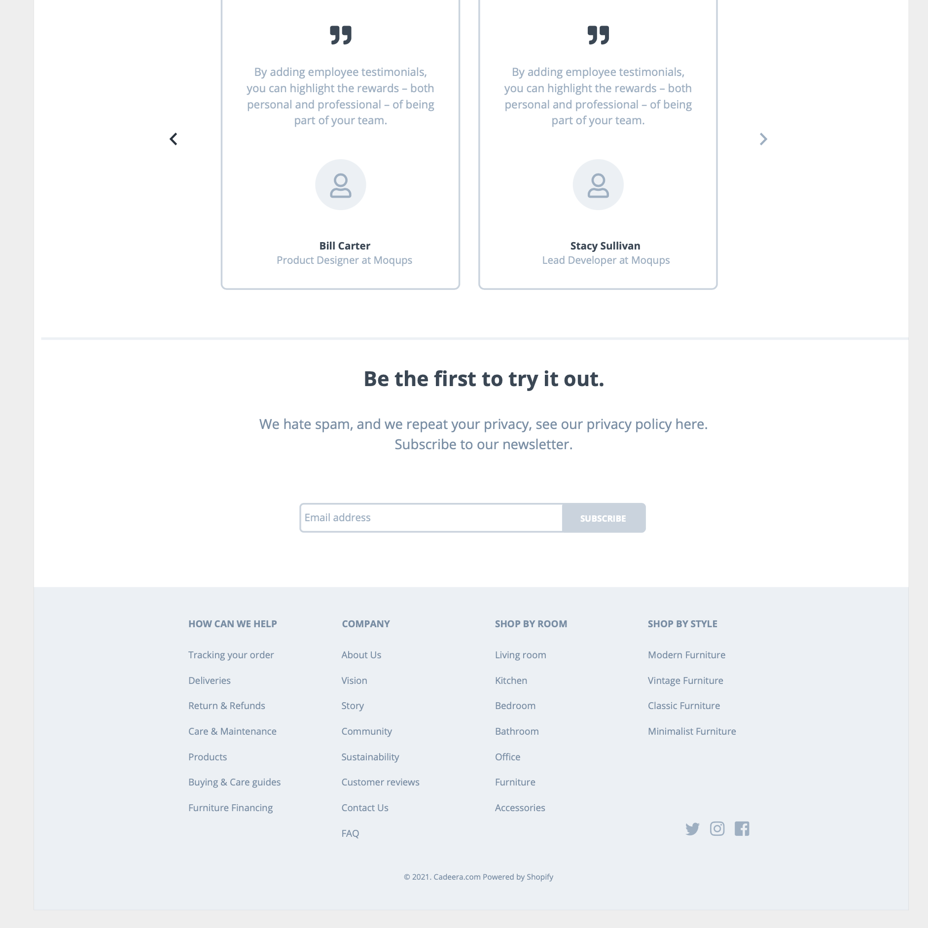
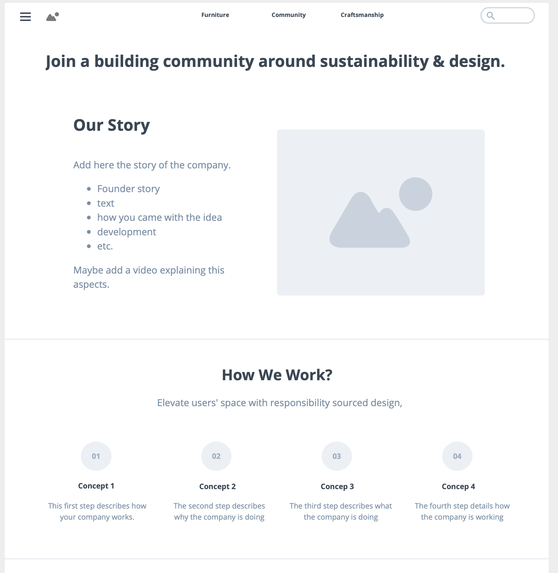
These wireframes were very simple. A three-color use on white pages as well as Lorem Ipsum text to fill the spaces where the text would be placed and some placeholders for photographs. I designed them with the purpose to highlight the different areas each page would have.
Each one of them had several sections accordingly to the content that would be display.

MOCKUP RE-DESIGN.
These mockups where design in Photoshop. My plan was to start creating simple mockups following what I had done for my wireframes. Overall, I added color to the website, images to replace the placeholders and ad- ded a few more sections to the pages that I thought would highlight better what Cadeera is all about.
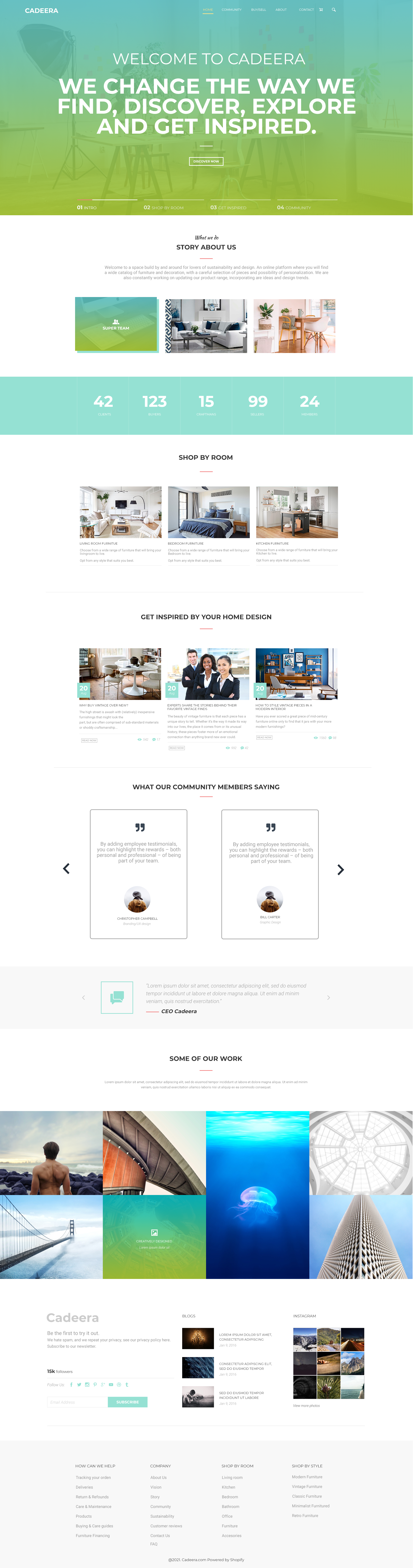
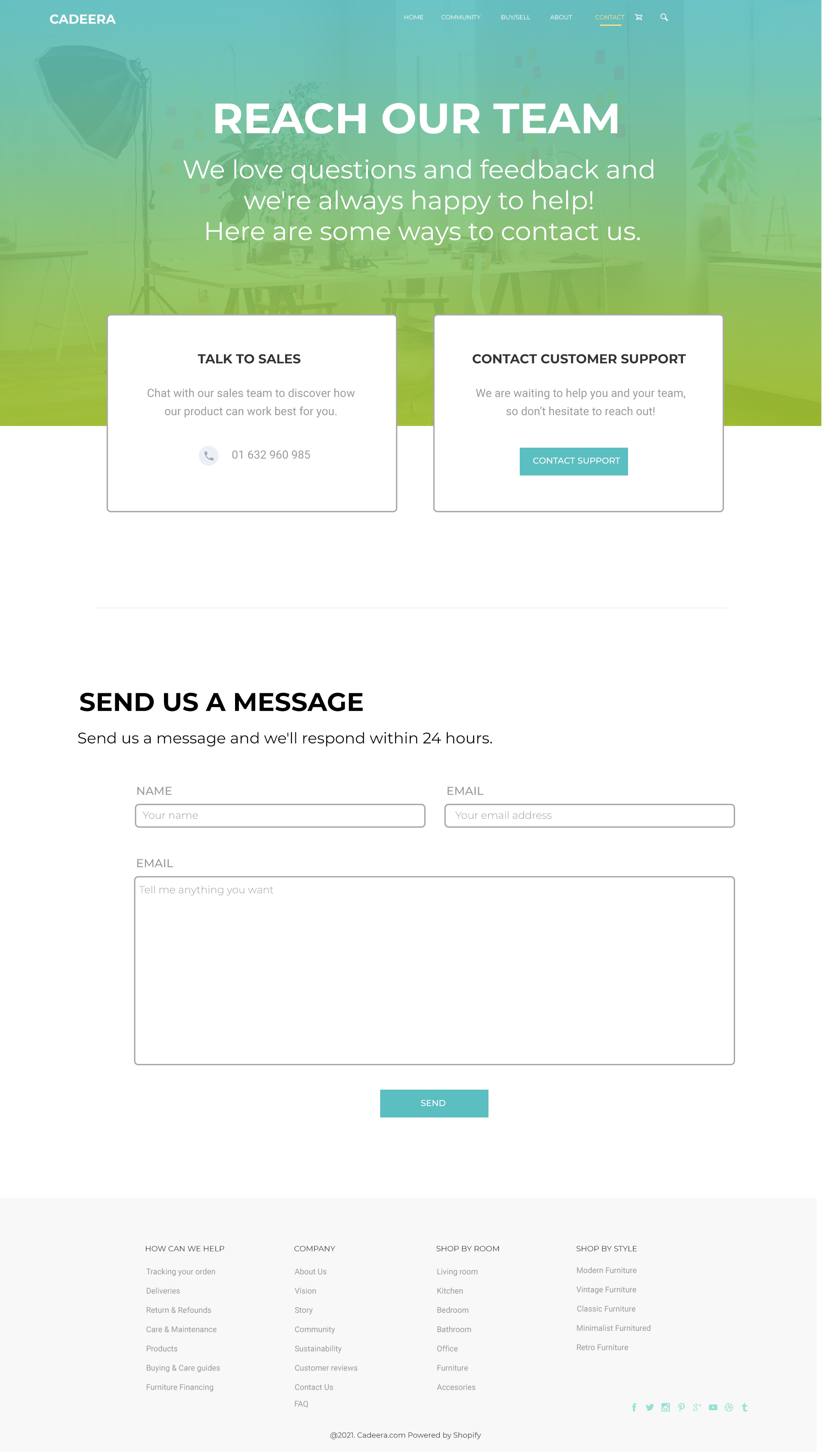
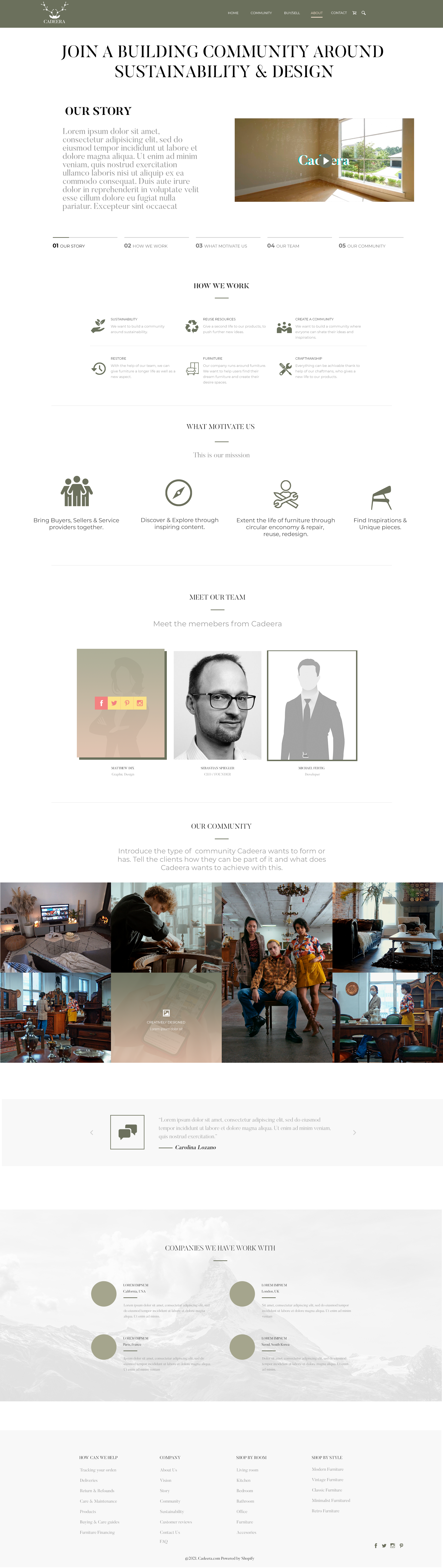
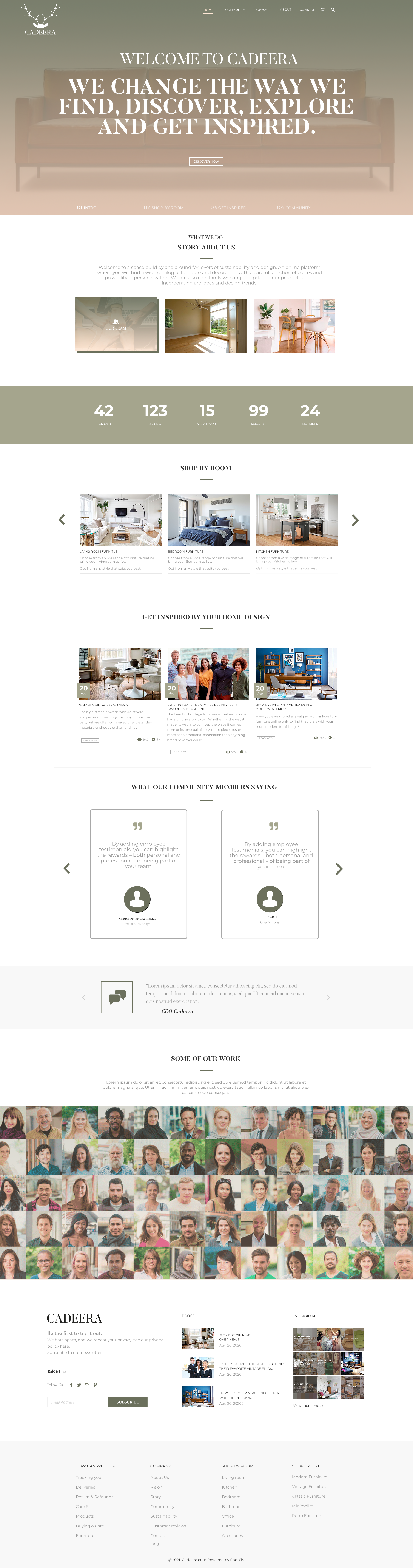
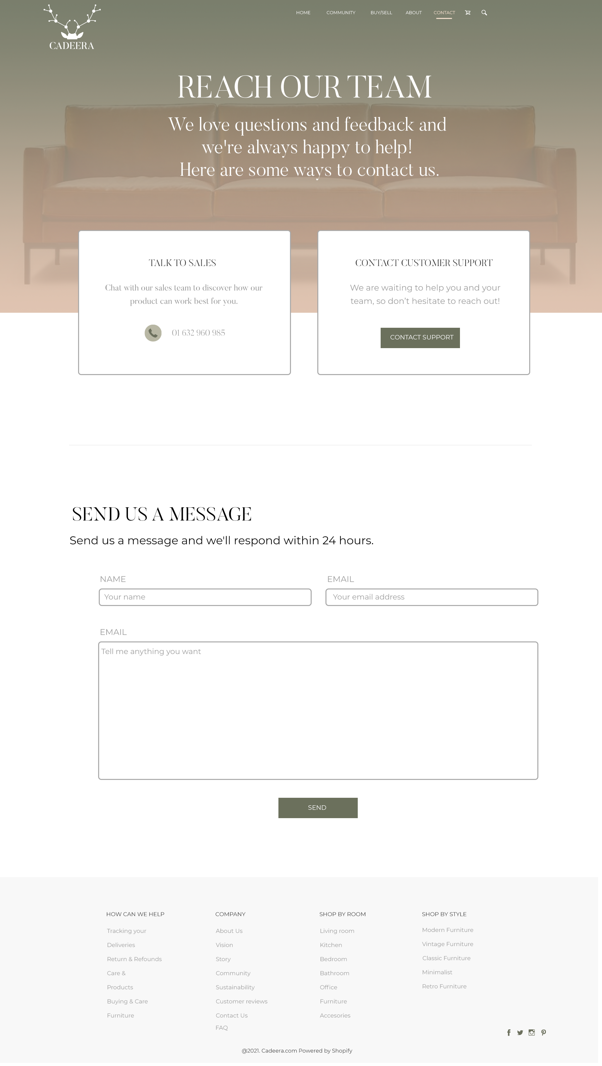
FINAL WEBSITE DESIGN.
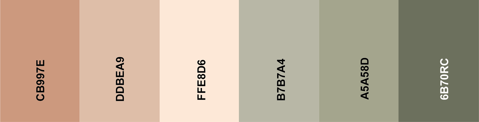
The final choice was to design which color pallet suited best Cadeera. I came up with the idea to opt for a pink pastel color pallet at is reminded me as the furniture color. This simple change made a significant impact, as it made the website look more bright, minimalist and gave a calm feeling. Additionally, to keep the cohesive aspect, I decided to include some images from the promotional video that one of my team members created and add them in the Community section on the website..