NEW/S ARTICLE
As I browsed through numerous news websites, I came upon a story that, despite the fact that its content , similar situations have occurred in the past, continues to pique my curiosity.
The subject of this article was a 15-year-old figure skater who tested positive for drugs. The major reason I chose this news is that, while we have all heard about athletes doping, this was the first time I had heard about an underage girl, which was surprising to learn because I had never thought a young girl of her age would do it. As a result, I decided to pursue this topic and design a poster that could convey a message to raise awareness about the issue.
NEW/S ARTICLE - 15/02/22
‘An emotional Kamila Valieva launched her bid for Olympic figure skating gold after a court cleared her to compete despite a positive drugs test’
TYPEFASE
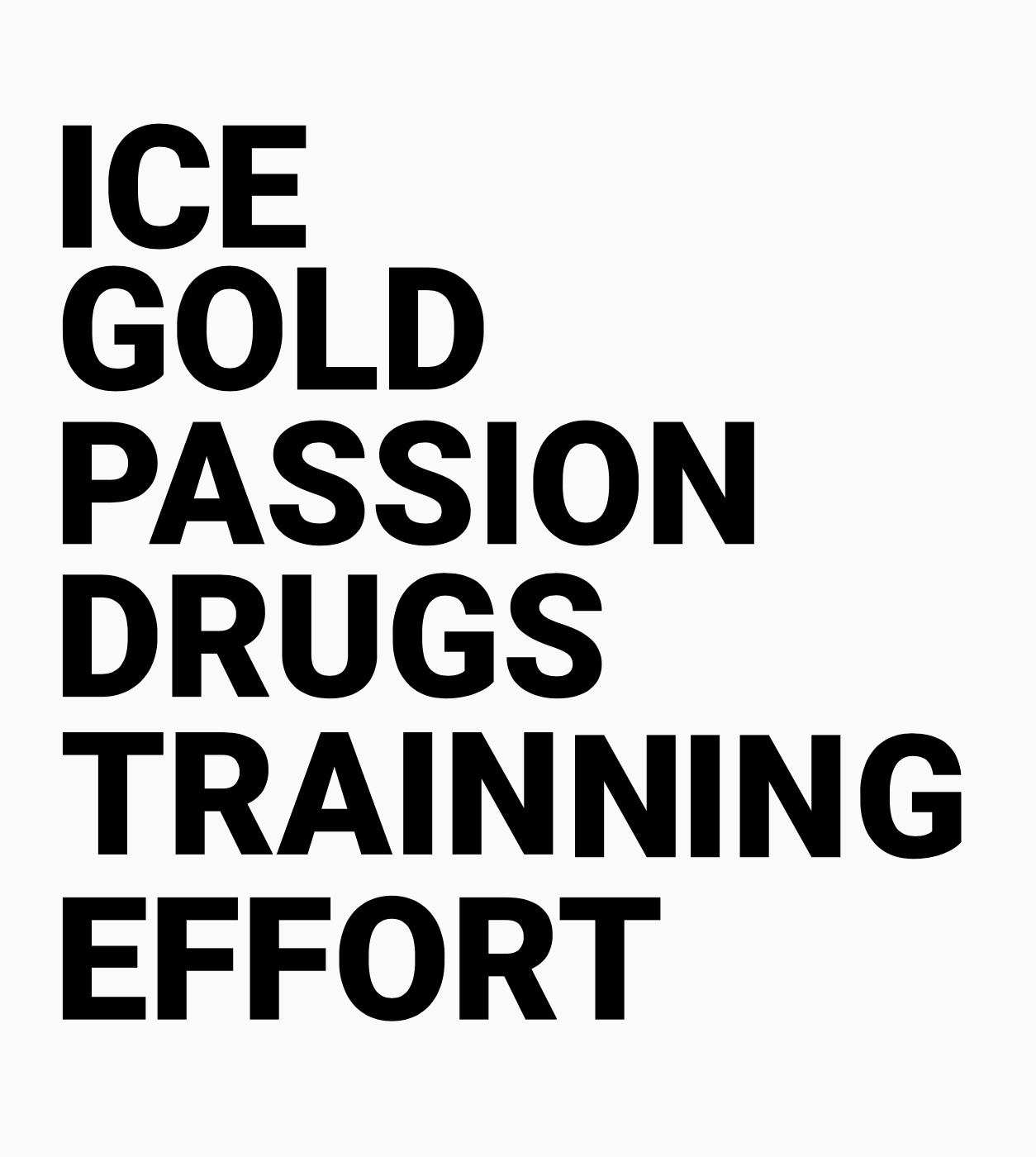
After writing words that describe what my article was about. I began to consider what kind of text I would use on my poster. I had to decide whether I wanted to include a sort message or just a few lines to convey my message.
Next, type; this step is often overlooked. I knew I wanted a text that was basic, bold, and straightforward. My investigation began with a look at fonts that were used to cover sports or sporting events of any kind.
As a result of this, I was able to cross paths with ROBOTO. It’s a neo-grotesque typeface with straight-sided capitals and rounded letters that seem like racetracks. But it was the fact that this font was designed to appear excellent on a variety of displays that drew me in. This feature was ideal for me be- cause, even though I was producing an A2 poster, my design could not be presented elsewhere or digitally.
IDEA DESIGN
After I had a clear understanding of what I wanted to accom- plish with the text, I began to consider what I could do with the overall design. To gather some ideas and inspirations, I began searching for typography posters, sports porters, and even minimalist posters.
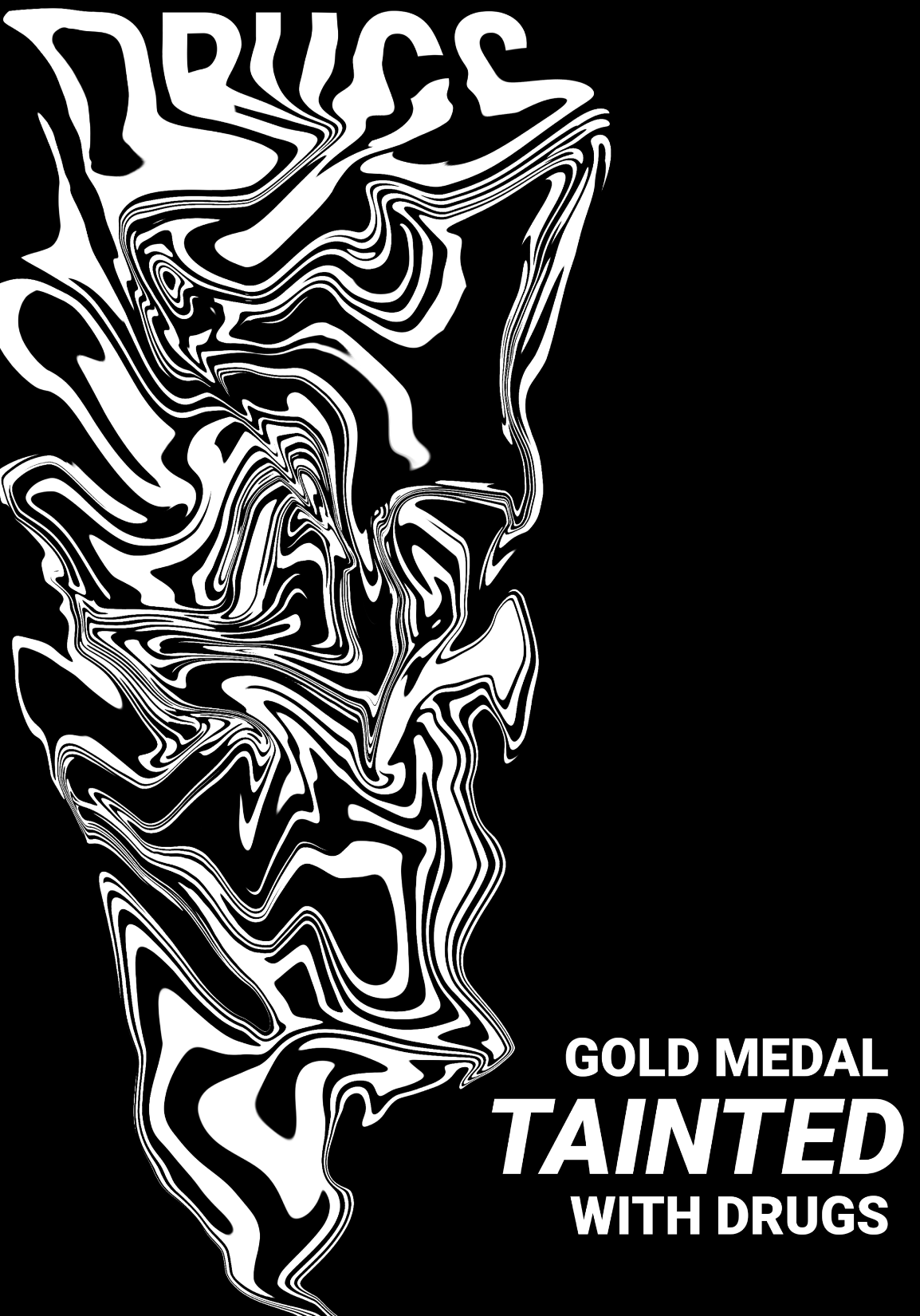
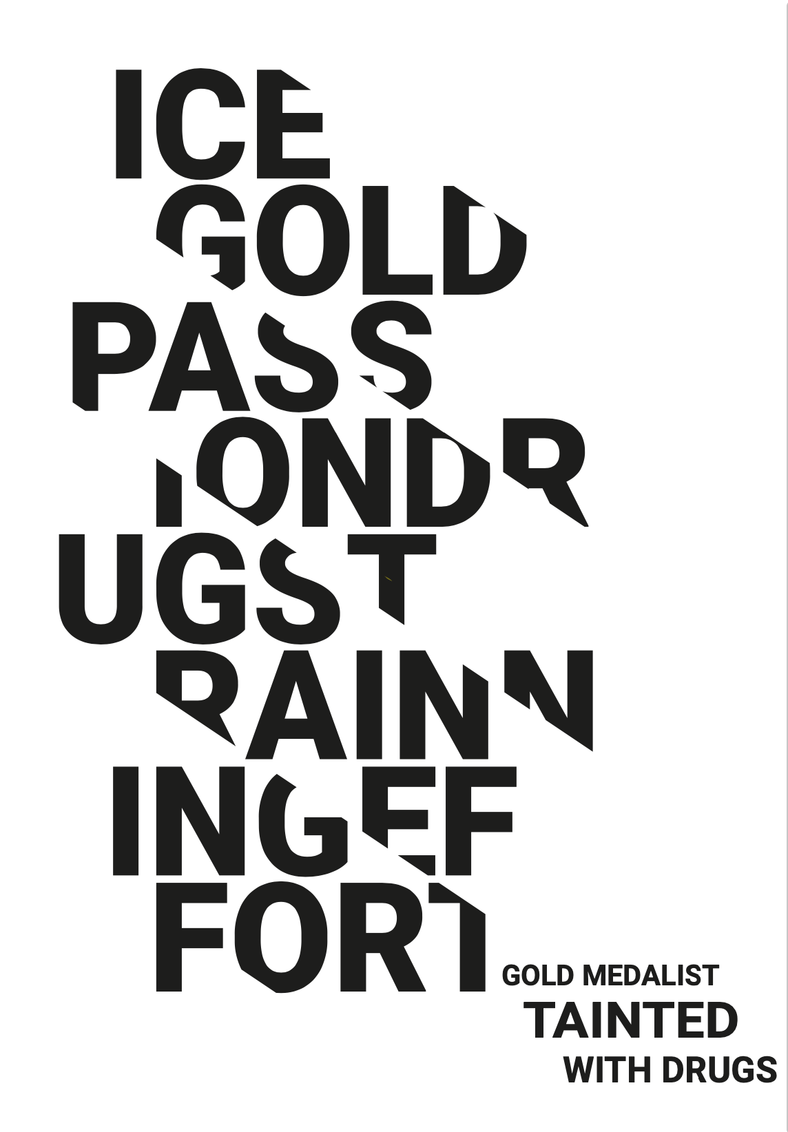
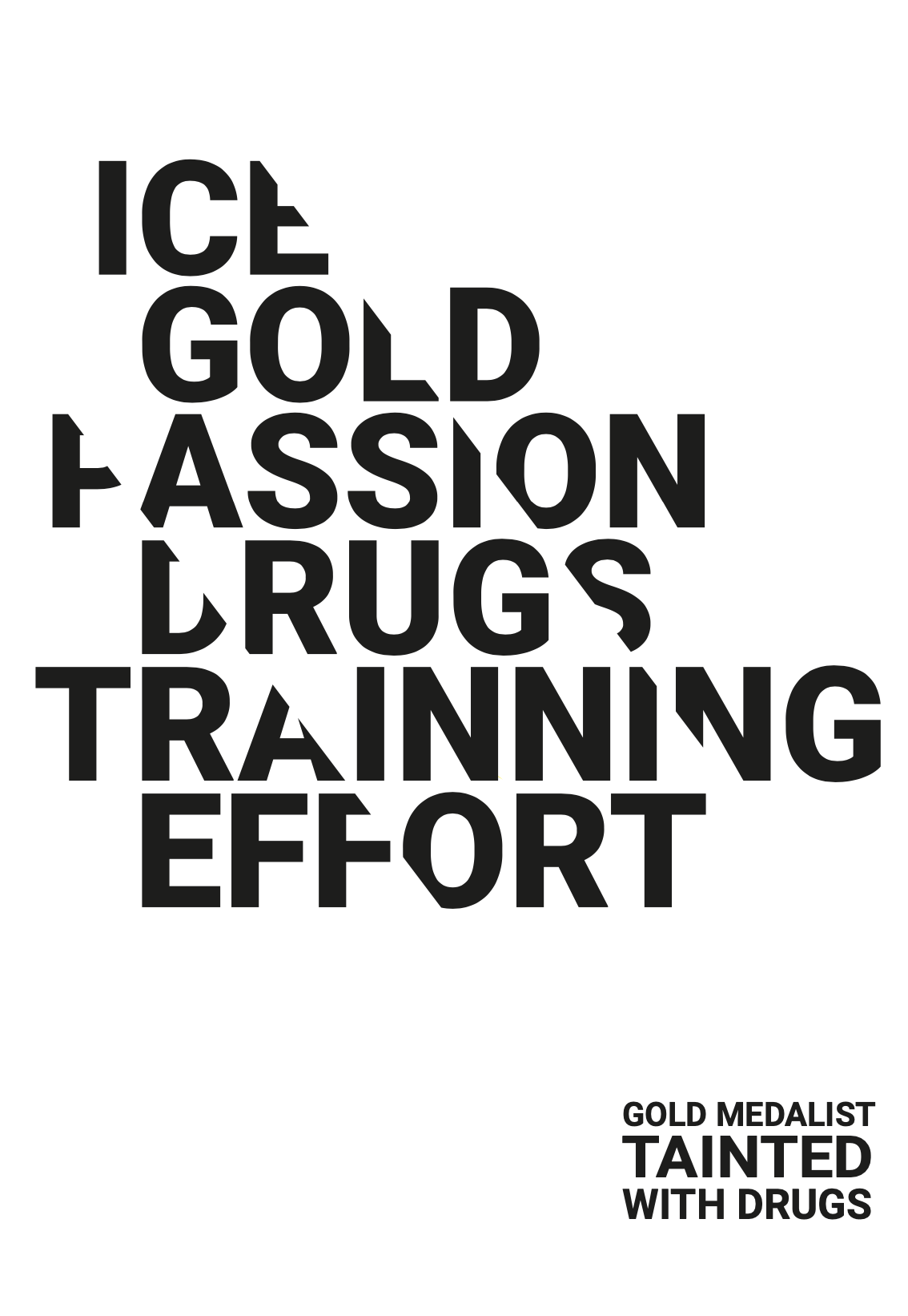
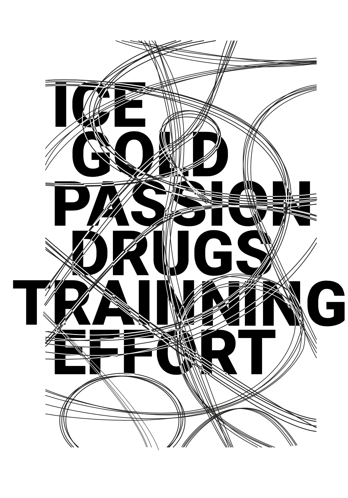
My first project was to design something that represented drugs. As we had previously explored the concept of abstract in class, I began to consider how I could demonstrate this. I developed this abstraction of drugs based on my prior abstractions of words, therefore I chose to use it but incorporate it with my words and add a text. I started with black and white to see if I could get a clear de- sign and if it could convey the message I wanted to portray.
The goal of this poster is to create the illusion of drugs in a straight line to resemble a trail that they leave behind. After some thought, I decided to try something new because this concept did not appeal to me because it placed too much emphasis on the drugs rather than the entire picture, which is the ice skater.
PROCESSES / MACHINERY
I began to consider what types of procedures I would need to use after I had a clear sense of the general ap- pearance of my poster.
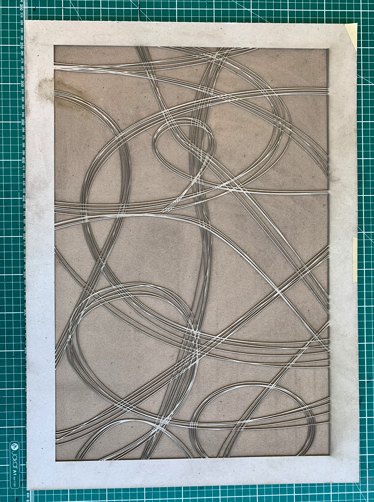
For this poster I will be using three different techniques: 1. Laser cut: designed a cardbord mold. 2. Embossing: relief of the lines.
3. Screen printing: appy text to the poster.
3. Screen printing: appy text to the poster.
LASER CUT
Embossing is a technique that uses a mold to create re- lief on paper. I will be using it to construct the lines in my design, so I will need to learn more about it.
In addition, instead of embossing, you can generate de- bossing, which is the inverse of embossing. Emboss pro- duces a sense of relief, whilst Deboss creates a sense of depth. This was something I had to think about because it would change the meaning of my outcome.
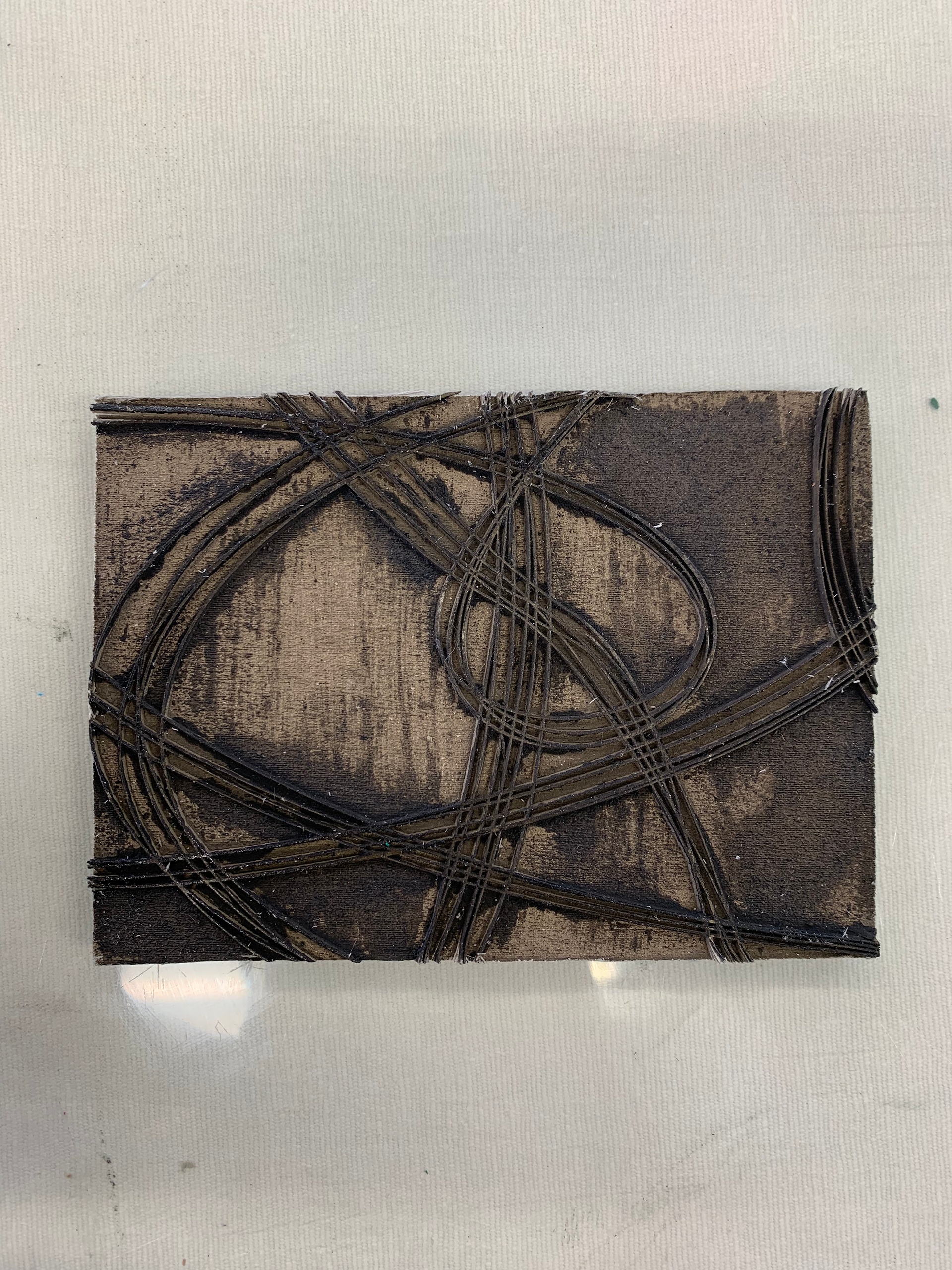
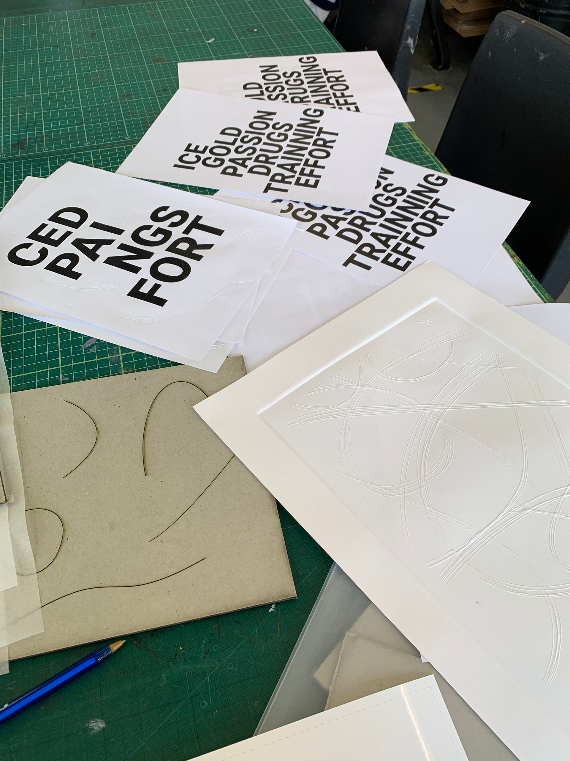
I needed to get the molds ready in order to test my paper. For this, I used an Ai file from a previous digital design to create the skate lines. Then I went to the 3D Workshop and printed two types of molds using the La- ser Cut machine.
For an Emboss result, one in an A4 scale of the overall design, and another smaller for a Deboss result. I was able to examine the results on the paper later and then pick which strategies would work best for my poster by doing so.
SCREEN PRINTING
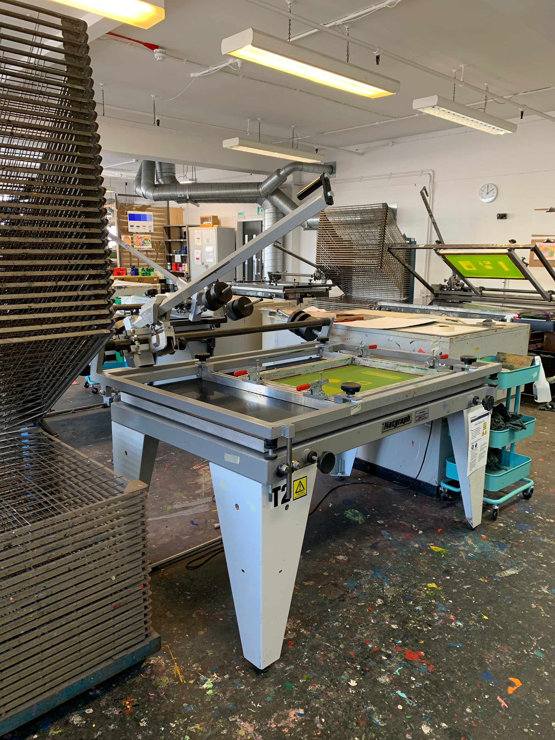
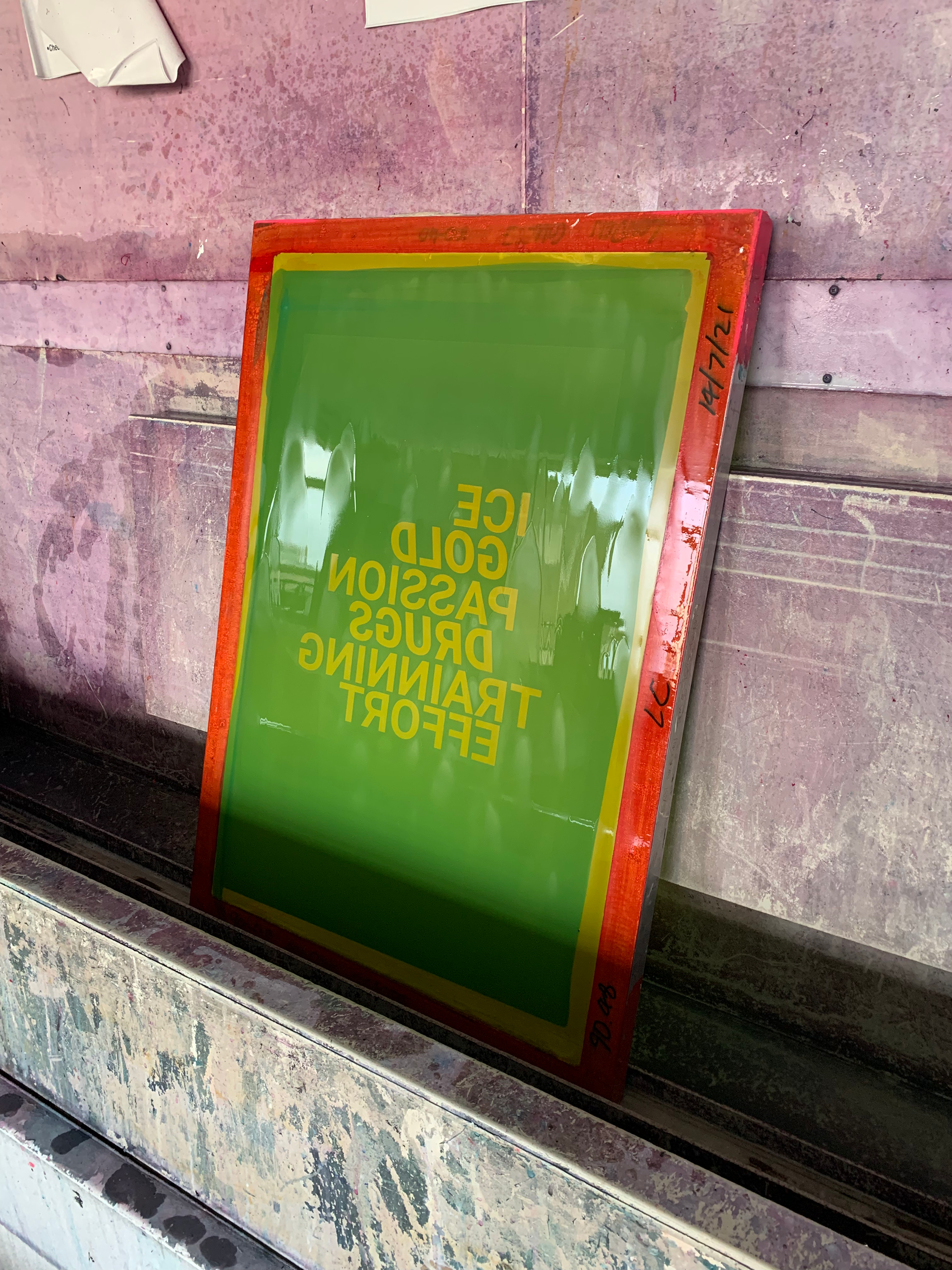
Screen printing uses a laser film paper to transfer the de- sign to a frame, which then serves as a foundation for the ink to flow through. Unfortunately, UAL does not currently provide laser film paper larger than A4, so I had to acquire one from an independent printing shop.
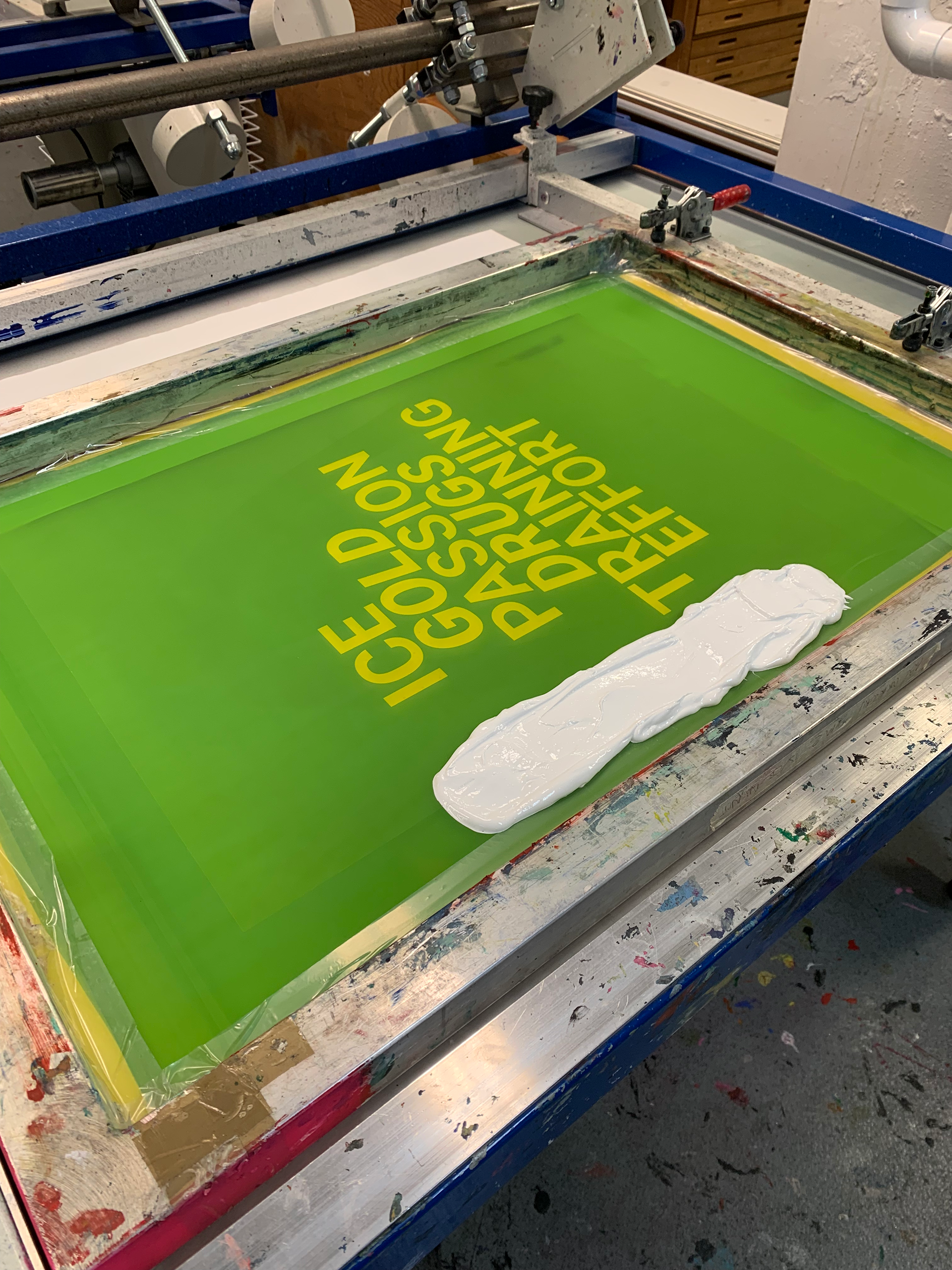
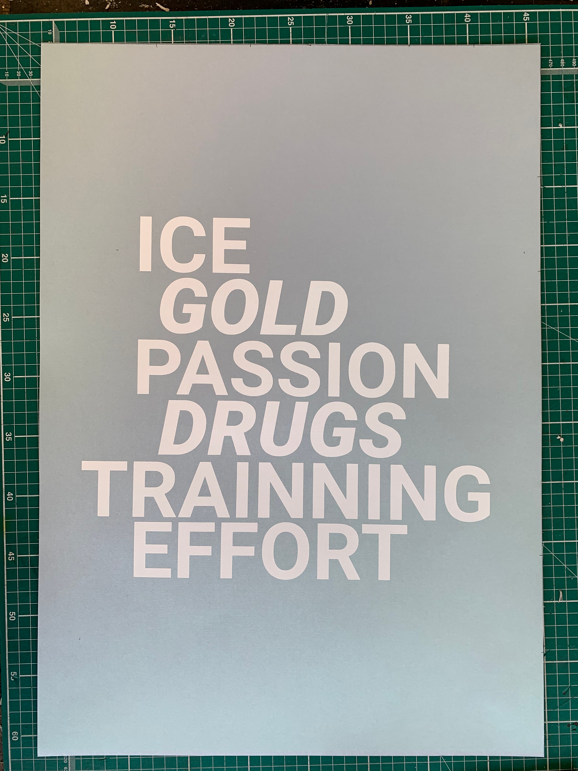
Once this step was done, I did all the steps required to prepare a frame with your design and finally printed my text onto my poster. For the laser film, I finalised my design digitally. I used RO- BOTO as my font weights Bold & Bold Italics with the size 208. As for the print text I used Gloss Opaque White paint found on the workshop.
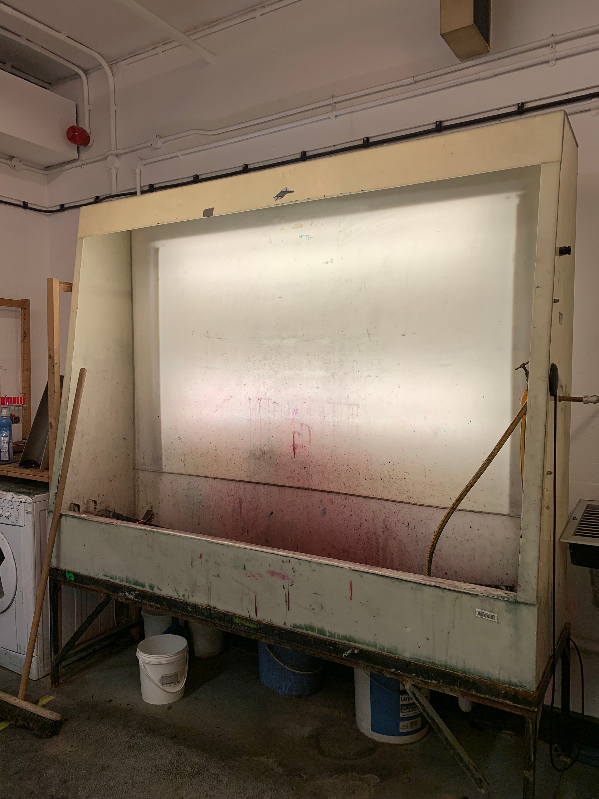
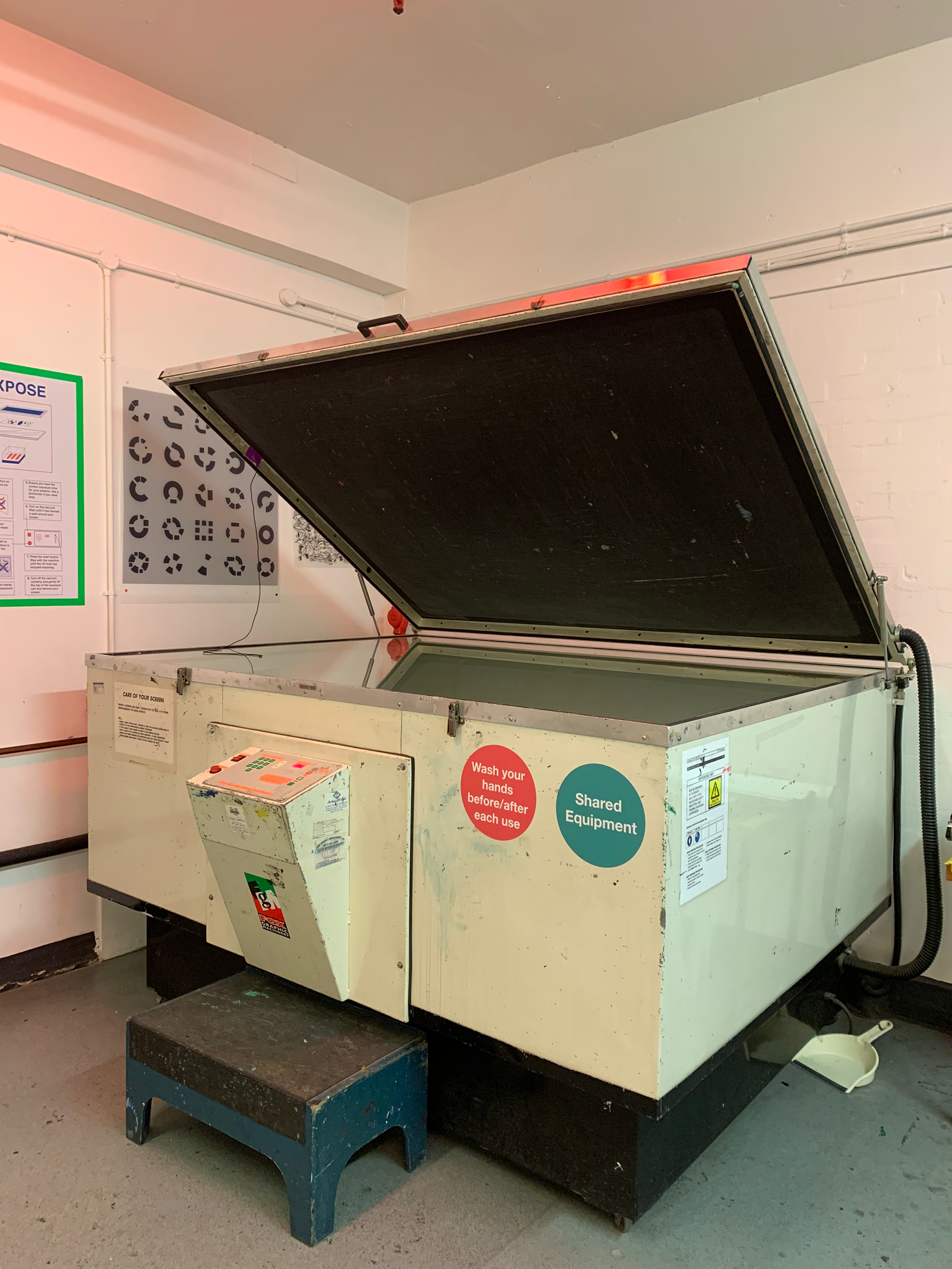
I will showcase this process with images in order of the steps required to active thE end result.
EMBOSSING
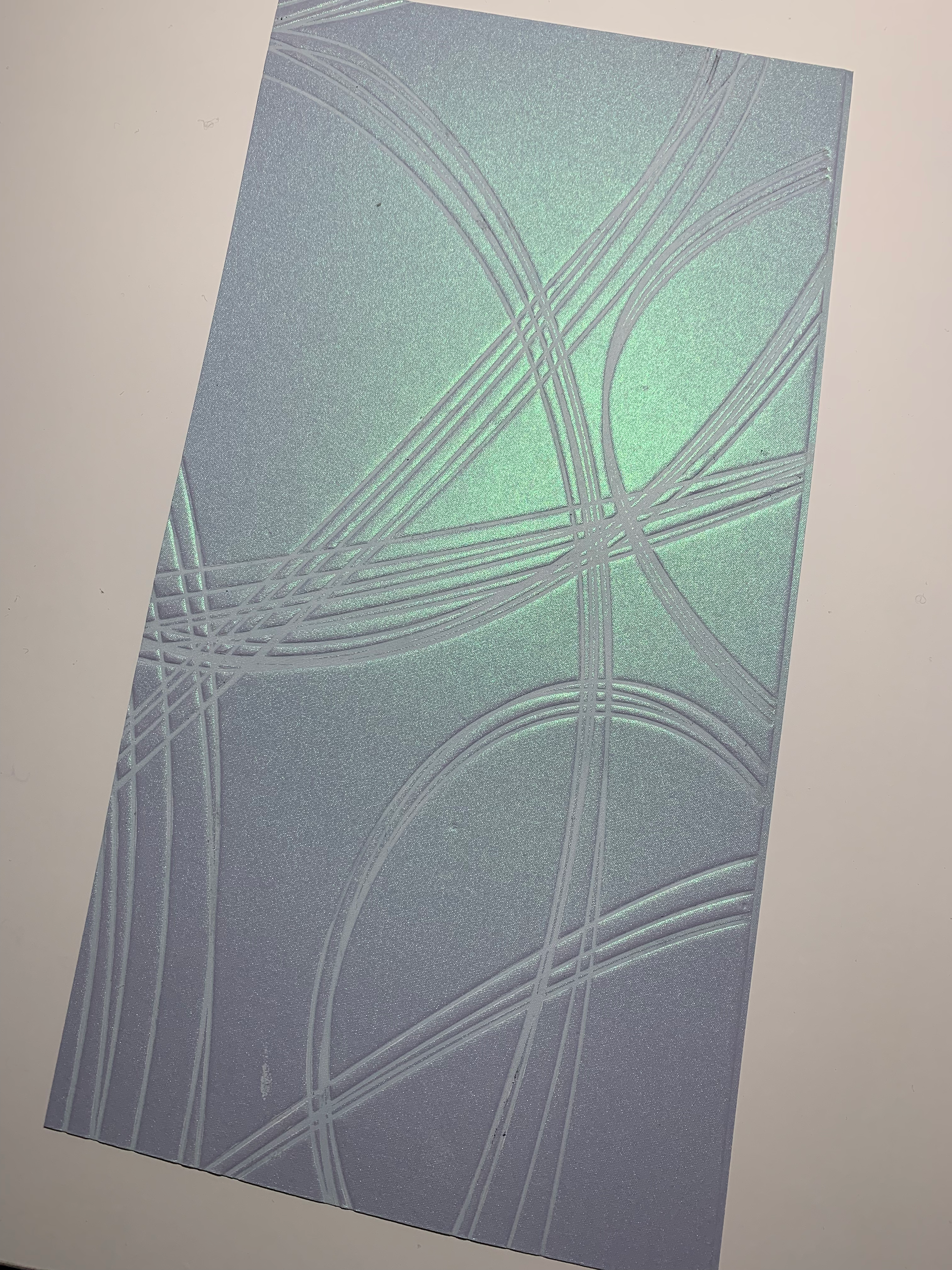
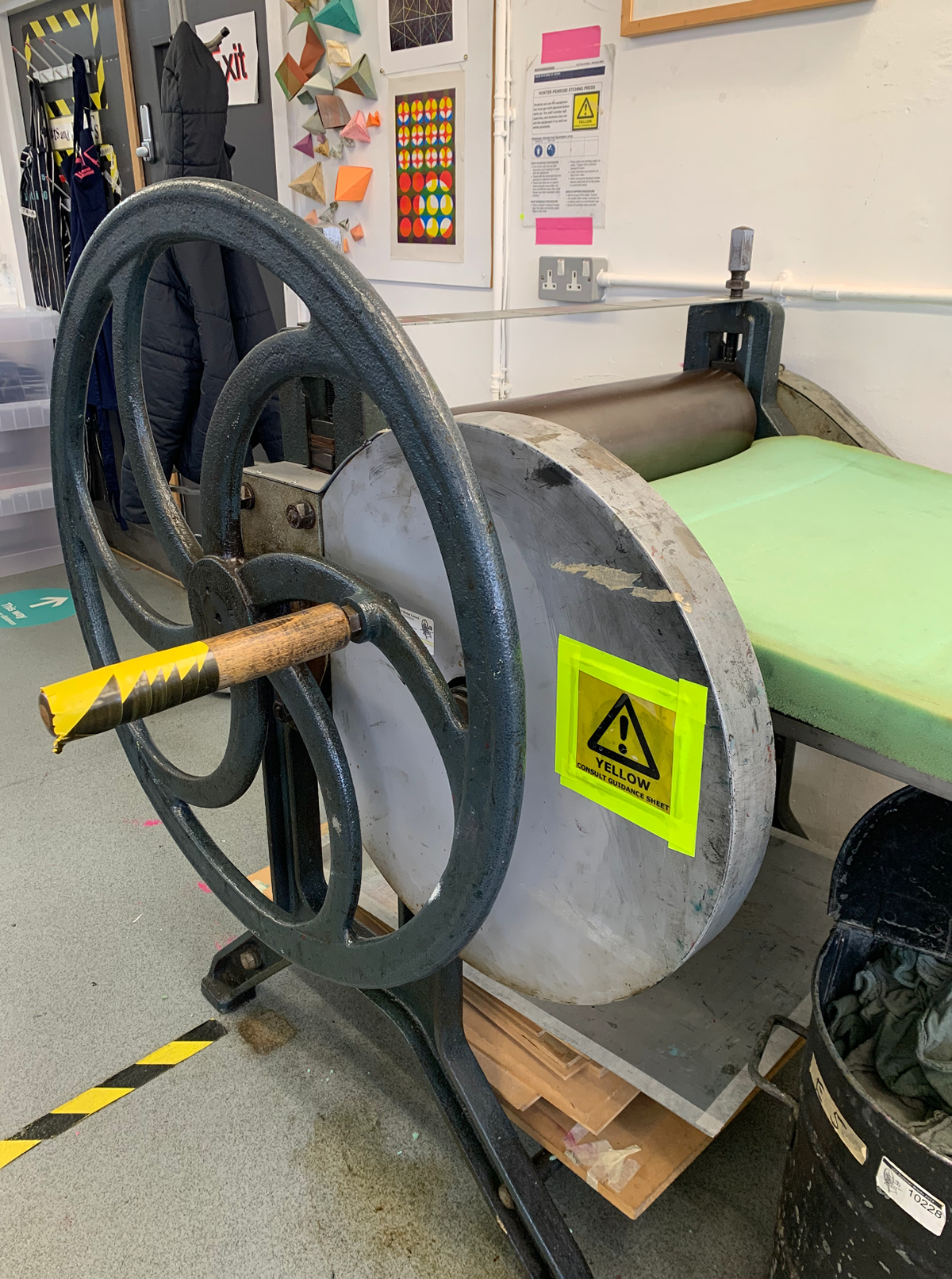
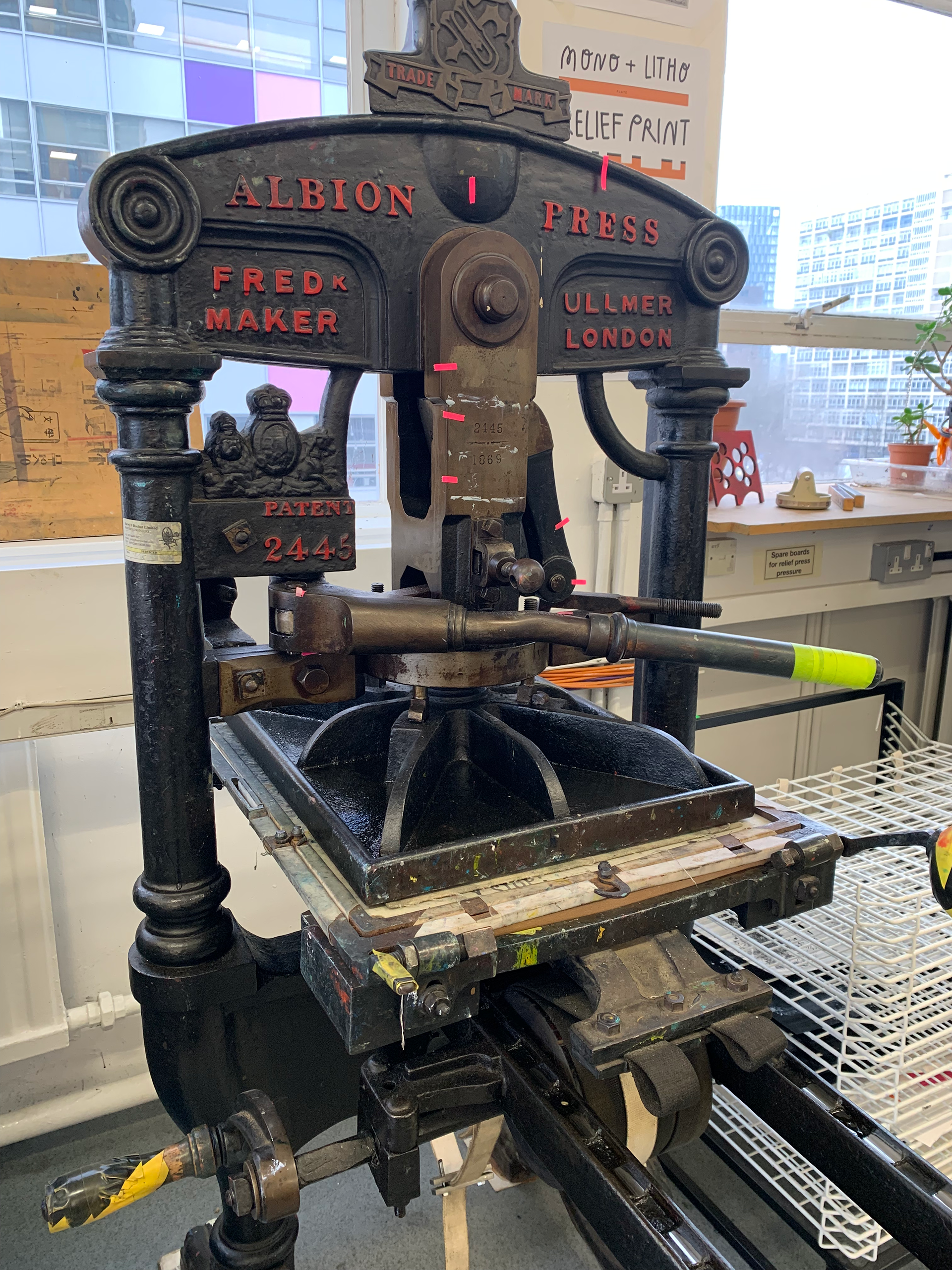
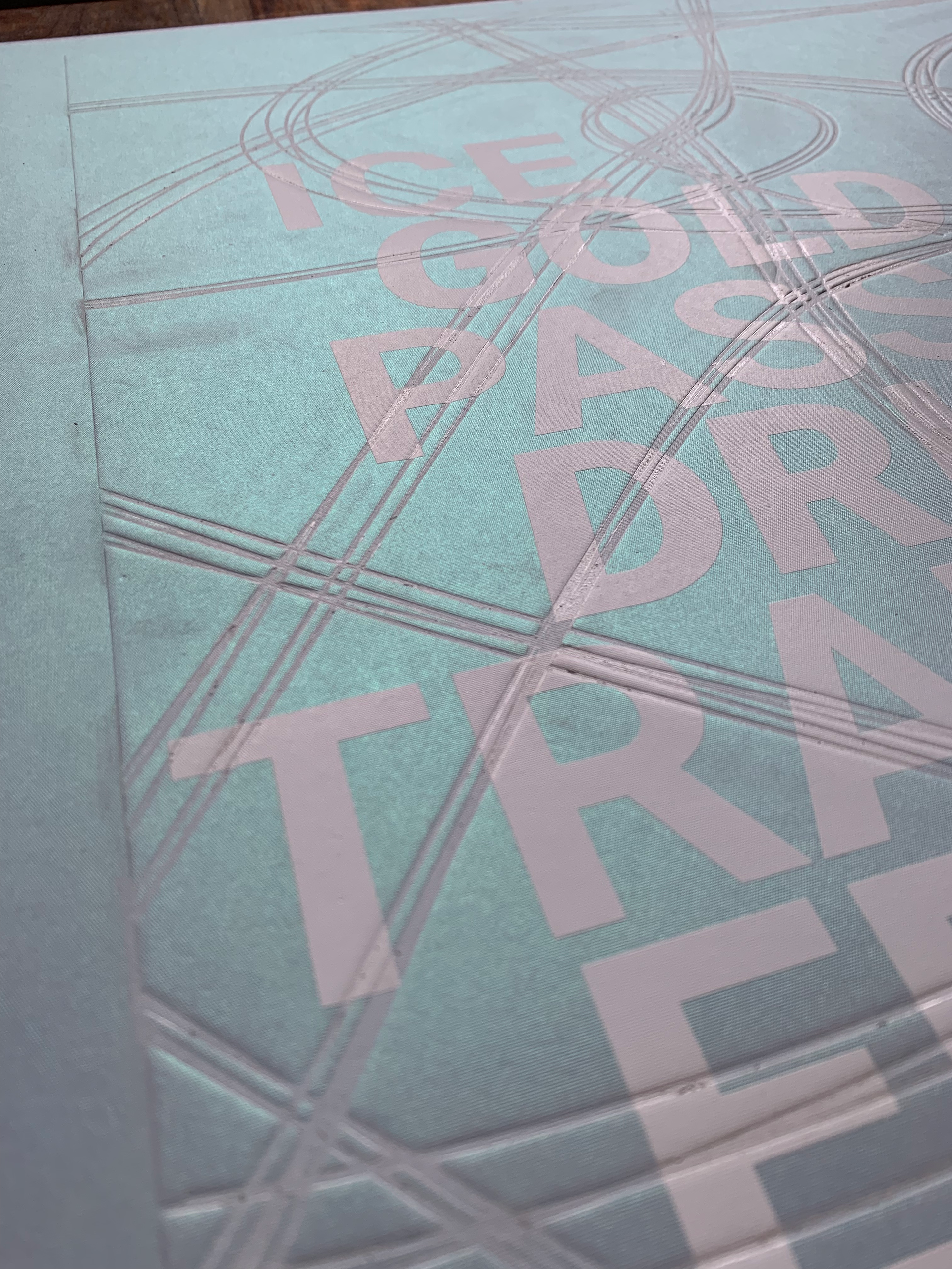
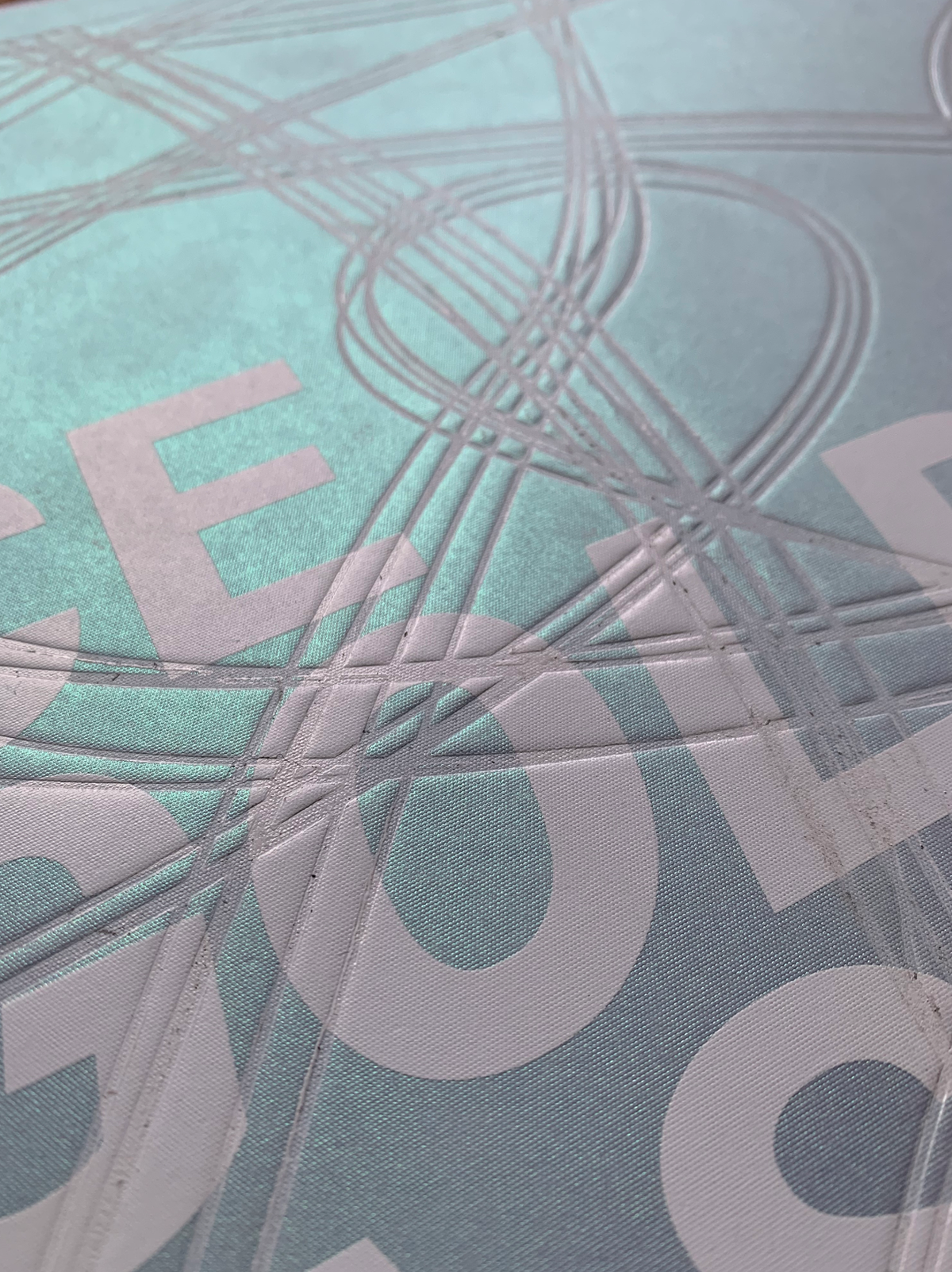
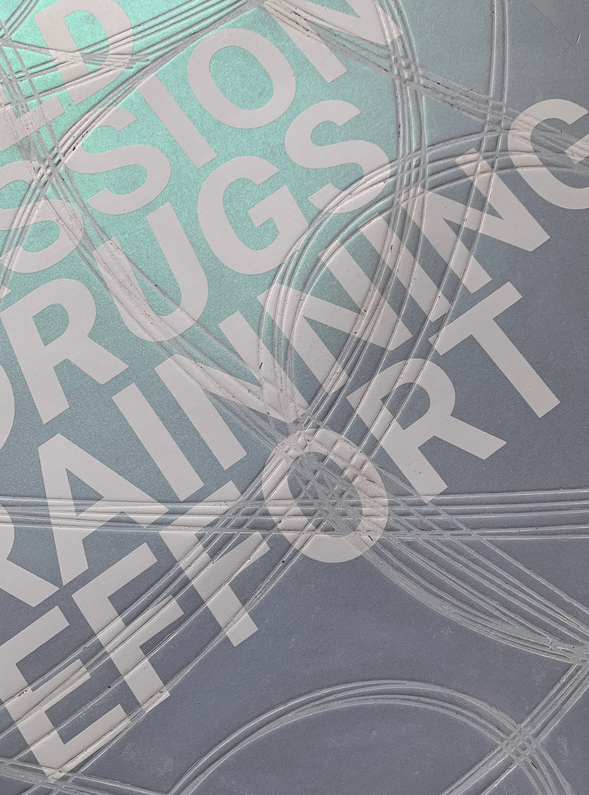
My poster was ready for the next process, embossing, after a few days of drying. In my instance, I decided to use the Deboss method. Initially, I chose Emboss because the lines appeared more prominent, but after considering that the size would grow because the poster is double the size of an A4, I reconsidered. But it was the fact that I considered genuine ice skating lines that led me to choose deboss. Because we slice the ice with our skates’ blades, it made more sense to go with Deboss, which deepens the paper and simulates real-life lines.
In addition, I chose to paint these lines by pouring a thin coating of paint on top of the mold, which was achieva- ble at the same time as the embossing process, to give them a more realistic look as well as a dramatic effect.
FINAL POSTER DESIGN
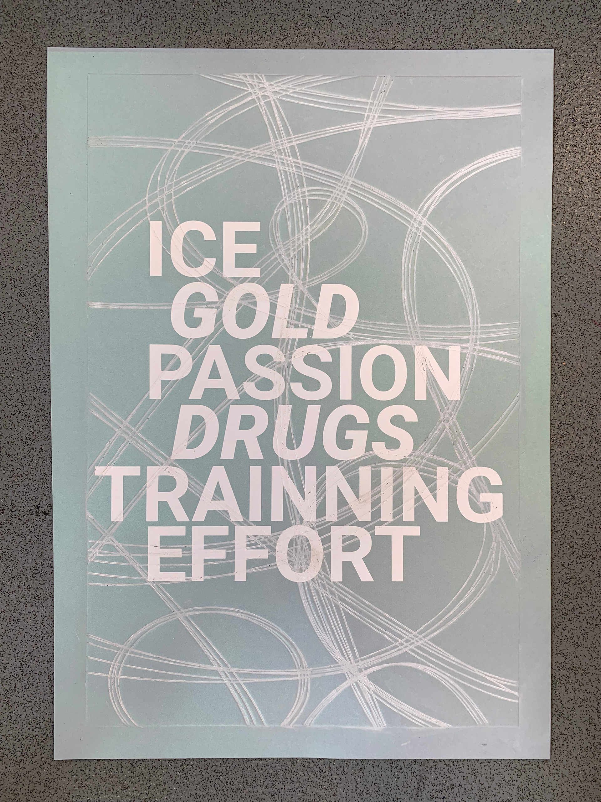
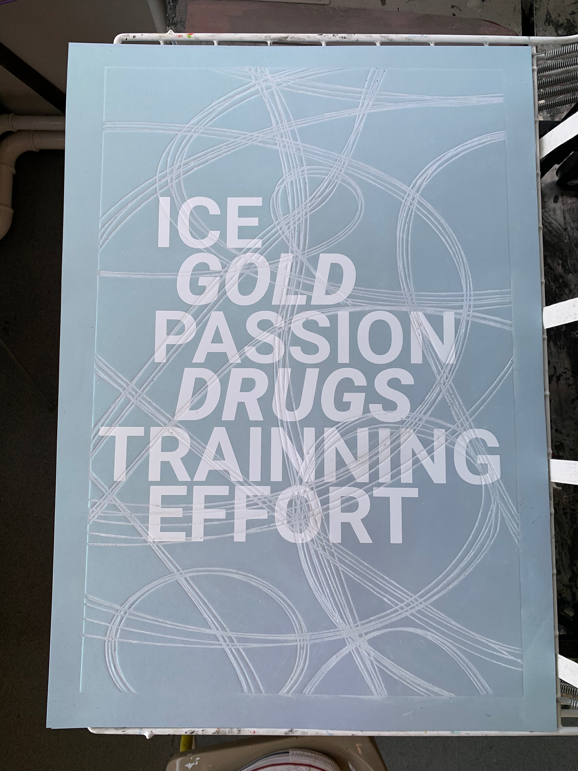
The poster’s overall appearance conveys my message. Tell the audience what the story is about. Making sure they know that this story is about a figure skater who tested positive for drugs.
The message is effectively communicated by the use of bold and clear writing, as well as the use of italics for two of the most important terms (Gold and Drugs), so that people under- stand exactly what the ad is about. Furthermore, the addition of color to the lines gives the lines a more icy aspect, repre- senting the blade carving the ice. Finally, using a colored post- er elevated my poster to a whole new level, since each feature perfectly suits my concept and creates an icy impact.
